So I have been taking a class entitled Introduction to SLR photography and have been learning lots of new things. Many of you may not be at all interested in what I've learned so if that's you, just go ahead and stop reading here. But, I once heard that if you want to really learn something you should read it, then write it, and then teach it. And so I will try and teach you what I've learned in hopes of it sticking and making sense to me. Each week in class the teacher presents a few concepts and then gives us the homework assignment of employing these concepts in pictures that we are supposed to take and bring to class the next week. Well, let me tell you, I take crappy pictures! Especially when compared to the rest of the class. The pictures people brought in for the first assignment blew mine away and I was really ashamed of the pictures that were mine. I think this intimidation made me blow off doing the assignment for the following week's class by claiming that I was just too busy to take pictures for my homework. Now in most classes that I have taken I have never been the smartest or highest achieving one in the class, but I have never felt like the most inferior one in the class (well except for the one lecture of the college physics class that I sat in for 20 minutes before I walked out and went straight to the registrar's office to drop). So this was a new feeling, and it didn't feel good. But you've got to start somewhere, right?
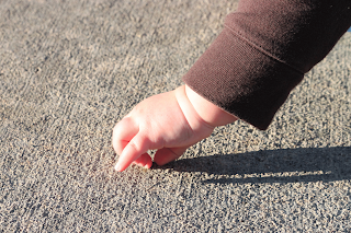
1. Hard light- a light source that is smaller than the subject you are photographing. An example is the sun- it's a hard light source because it's small in comparison to all the subjects you are photographing. Hard light produces crazy shadows because it only hits one part of the subject and most of the time is really unflattering for portraits. Hard light though shows textures really well though so it has a use. Here is my example of hard light- see the harsh shadow but also notice how you can really see the texture of the sidewalk:
 2. Soft light- a light source that is bigger than the subject you are photographing. An example is a lamp in your house, or those crazy lighting sources that you seen in photography studios. Soft light is just as it sounds, nice and soft. Since it is a larger light source it can wrap around the subject illuminating it from all angles. Good for portraits, though textures aren't as apparent. An example of soft light- how majestic does Daisie look?
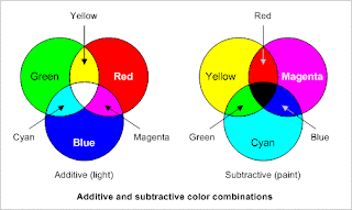
And that's all I've got for light. Next we move on to color. We all know that the primary colors are red, green, and blue. Well, these are the primary colors of light. The primary colors of pigments are yellow, magneta, and cyan. I only tell you this because I learned something new here, in that cyan is sort of an aqua color when all along I thought it was a yellow color for some reason.
 And so now that we know the primary colors, here is how to use color theory to compose photographs:
1. Analagous colors. Analagous colors are colors that lie next to each other on the color wheel. Using colors that are analagous in a picture creates a more soothing picture.
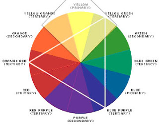 2. Complimentary colors. Complimentary colors lie directly across from each other on the color wheel. So, purple and yellow, red and green, orange and blue, etc. Having complimentary colors in a photograph makes the colors seem more vivid. Color theory of complimentary colors isn't just applicable to photographs, its also really helpful when trying to pull together a great outfit. Lets say you've got this cute cardigan (and yes, I would love this cardigan) and you want to wear something underneath it that's more fun than a basic white or black, but you're just not sure what color. Then you remember reading this way too long blog post and take the one piece of useful information from the post to pick out this shirt to wear underneath the sweater. And you're welcome, you will look fabulous in that outfit. Here's my picture for this portion of the assignment (it's a lame attempt but I couldn't find any complimentary colors in nature since there aren't any flowers in bloom right now. But a great example of this would have been the purple and yellow pansies that people often plant together).
3. Monochromatic colors. Just as it sounds, monochromatic photos have one predominant color running throughout the picture.

Well, that about raps up week three of my photography class. If you're still awake- well done. I'll try to come up with something more exciting for the next post.
You dropped physics? Pansy.
ReplyDeleteThanks for this post - I learned a lot.